Tuesday, 2 August 2011

Postage stamps


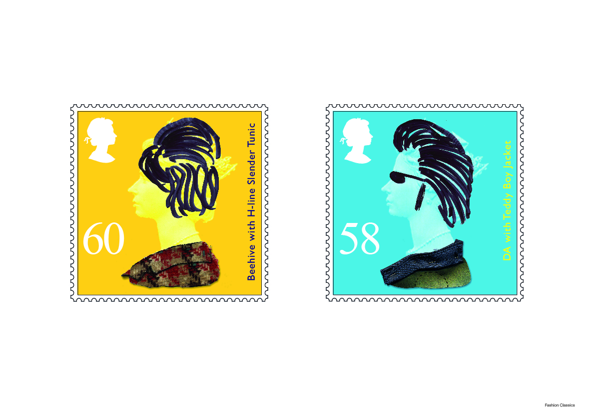
For this brief we had to create a series of stamps based on fashion classics. I went about this by dressing u the classic queens head stamp in fashionable hairstyles and clothing over the years. I done so the hair was drawn over the top. So defacing it like someone would to a magazine or newspaper. Im really pleased with the outcome even though they probably would not be aloud due to treason :P but they are very humorous and unique which was my aim after my initial ideas.

More photography...


This is a photo I took on a day out to Eastbourne. I really liked the depth of the picture and the way the flowers sit in comparison to the sky. Looks like it should be on a calender :P

Motion


This was a 3 hour brief where we had to come with a name, logo and promotional piece for the possible products being made in the TV program 'Design for life'. I went with the product concept of the device the helps people get up and walk more easily than with a walking stick. As this was its main feature i decided to call it 'motion' with the 't' and 'i' represented by someone with a stick.


These are the photo's of the packaging i designed. I think this would look much better if made to store standards but i think ive done a good job with the resources available. The main thing is you can see the concept in the packaging.

Pop-up packaging


This is the net for a car shampoo that I designed. All the car shampoo's that i saw out there were bottled so I wanted to make something more outrageous and fun. I decided to create some pop-up packaging that is two boxes put together to make a rectangle and when folded out pops up into a car.

For grid sake!


This is my final piece of Xaliba work. This was for my other word which was grids. I kept the grid lines that i used in very faintly to show why everything is where it is. Everything lines up and looks balanced. Thank god for grids! :P

Expressive explosion!


This is my second piece of work for the word expressive. I created this so that the letters express what they look like. So the 'R' is quite urban looking so i done graffiti coming from it. Its as if the typeface has its own personality. I drew it all originally in biro and then edited it in Photoshop and Illustrator.